VCD Player Pro
It is about Visual Communication Design(VCD) course. And we are group P so come out with player. The last word "pro" just because the vcdplayer web address is not available thus we add pro at the end. It is also our target to aim to.
4/09/2011
4/04/2011
Design process and all the links
User test in Hague

Results:
In map for Route K, 91% of participants want to go clockwise direction, which fits our intention. While in map for Route P, 67% of participants want to go anti-clockwise direction, which goes accord with our intention. The main reason for this difference is that clockwise means natural direction to most people. And the second reason is that the icons for museums are very attractive, and visiting museums are also goals of most travelers. Another interesting reason is that pizza seems delicious and attractive.

After calculating data from two groups, we make three diagrams of elements which help people to distinguish between two versions of maps. 88.5% of participants find the difference of color, 30.8% find the difference in size and 15.4% find the difference in orientation. We can conclude that color has the biggest impact.
After discussion with the results, we plan to make some improvement on maps:
- The big icons for museums and shops are staggered arranged.
- Color saturation changes of icons for museums and shops are more obvious.
- The small icons for museums and staggered arranged.
- The size of small icons changes.
- The transparency of small icons changes.


4/02/2011
Tutor meeting
After that, we had a meeting with professor. He gave us some suggestions and we changed our map a bit.
The main changes are listed as following.
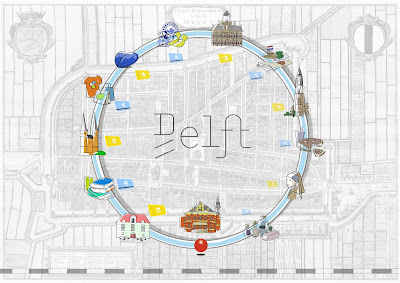
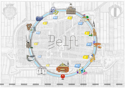
l The circled block in the background is moved out. Now the background is a whole ancient map. There are no area that is paid more attention.
l All the free hand drawing icons for museums and shops are moved in the circle.
l In the previous version, the icons for shops are only logo for some shops, which is not as interesting as the museums icons. Now all the icons for shops are drawn by hand.
l The starting point is moved to central line of the circle, and the railway is horizontal and the color is softened. All these are meant to prevent any influence from the starting point and the railway.
l The icons for museums and shops should be almost the same size to balance the circle.


Now how do you think about the Delft Map?
We plan to test it in Hague. There are two groups with two people in each group. Since none so us speak Dutch, it will be a challenge for us!
4/01/2011
Pilot Test
On Friday, We did some tests with our friends. They gave us some comments:
- The icons for museums are too interesting, which attracts too much attention of people.
- The brand images of shops are boring and too small to catch people.
- The yellow color determines the direction, the shadow doesn't do a lot job.


3/31/2011
First version of Route T and Route P


To help uses to distinguish between these two versions of circles, we add three elements in our design: color contrast, size contrast and shadow change. In the route P for shopping, we make icons for shops larger yellow circles, while the icons for museums are smaller and grey. When seeing the image, users’ attention will be attracted by the yellow ones, and choose the anti-clockwise direction. Besides, the upper left shadow indicates the light sources comes from bottom right direction and attracts users to choose the anti-clockwise direction. While in route T, elements are entirely opposed, hints for clockwise direction will be more obvious.
In our progress for designing the map, we make several versions and test the function of shadow and color. The color contrast works better than shadow change. Some users even feel nothing about the change of shadow.
