Results:
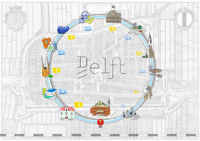
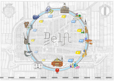
In map for Route K, 91% of participants want to go clockwise direction, which fits our intention. While in map for Route P, 67% of participants want to go anti-clockwise direction, which goes accord with our intention. The main reason for this difference is that clockwise means natural direction to most people. And the second reason is that the icons for museums are very attractive, and visiting museums are also goals of most travelers. Another interesting reason is that pizza seems delicious and attractive.

After calculating data from two groups, we make three diagrams of elements which help people to distinguish between two versions of maps. 88.5% of participants find the difference of color, 30.8% find the difference in size and 15.4% find the difference in orientation. We can conclude that color has the biggest impact.
After discussion with the results, we plan to make some improvement on maps:
- The big icons for museums and shops are staggered arranged.
- Color saturation changes of icons for museums and shops are more obvious.
- The small icons for museums and staggered arranged.
- The size of small icons changes.
- The transparency of small icons changes.


hmm, I am not sure what you mean by all this....
ReplyDeleteDo you want to change it? Or did you changed it after the usertest? I thought this map was in the presentation as well...?
And what do you mean with "staggered"?
Try to write in proper English,what you want to tell me is not clear to me at all.. (sorry)
But still I like your map, and the most I like your visualisation of the results... (the pink and yellow box together with the example)
Uhm.. You say the main reason for going clockwise (in the results part) is because this is a natural direction..
ReplyDeleteBut what about the visual queries you used in your map? Did they work? Or was is just because of the natural direction and the pizza the participants choose the intented direction?