4/09/2011
4/04/2011
Design process and all the links
The following are the process of our design
Before design: Discussing about clues for making map
First concept of the map
Second concept of the map
User test in Hague
On Friday, we went to The Hague Centre to do user test. We four people were divided into two groups: group A and group B. Group A stayed in the station and did 15 user tests with map for Route P. While group B went to the zoo nearby and did 11 tests with map for Route T. Almost half of the participants are Dutch and the other half are visitors from other countries.

Results:
In map for Route K, 91% of participants want to go clockwise direction, which fits our intention. While in map for Route P, 67% of participants want to go anti-clockwise direction, which goes accord with our intention. The main reason for this difference is that clockwise means natural direction to most people. And the second reason is that the icons for museums are very attractive, and visiting museums are also goals of most travelers. Another interesting reason is that pizza seems delicious and attractive.

After calculating data from two groups, we make three diagrams of elements which help people to distinguish between two versions of maps. 88.5% of participants find the difference of color, 30.8% find the difference in size and 15.4% find the difference in orientation. We can conclude that color has the biggest impact.

After discussion with the results, we plan to make some improvement on maps:
- The big icons for museums and shops are staggered arranged.
- Color saturation changes of icons for museums and shops are more obvious.
- The small icons for museums and staggered arranged.
- The size of small icons changes.
- The transparency of small icons changes.

Route K

Route p
4/02/2011
Tutor meeting
After that, we had a meeting with professor. He gave us some suggestions and we changed our map a bit.
The main changes are listed as following.
l The circled block in the background is moved out. Now the background is a whole ancient map. There are no area that is paid more attention.
l All the free hand drawing icons for museums and shops are moved in the circle.
l In the previous version, the icons for shops are only logo for some shops, which is not as interesting as the museums icons. Now all the icons for shops are drawn by hand.
l The starting point is moved to central line of the circle, and the railway is horizontal and the color is softened. All these are meant to prevent any influence from the starting point and the railway.
l The icons for museums and shops should be almost the same size to balance the circle.

Route P

Route T
Now how do you think about the Delft Map?
We plan to test it in Hague. There are two groups with two people in each group. Since none so us speak Dutch, it will be a challenge for us!
4/01/2011
Pilot Test
On Friday, We did some tests with our friends. They gave us some comments:
- The icons for museums are too interesting, which attracts too much attention of people.
- The brand images of shops are boring and too small to catch people.
- The yellow color determines the direction, the shadow doesn't do a lot job.

Route P

Route K
3/31/2011
First version of Route T and Route P

Route P

Route T
To help uses to distinguish between these two versions of circles, we add three elements in our design: color contrast, size contrast and shadow change. In the route P for shopping, we make icons for shops larger yellow circles, while the icons for museums are smaller and grey. When seeing the image, users’ attention will be attracted by the yellow ones, and choose the anti-clockwise direction. Besides, the upper left shadow indicates the light sources comes from bottom right direction and attracts users to choose the anti-clockwise direction. While in route T, elements are entirely opposed, hints for clockwise direction will be more obvious.
In our progress for designing the map, we make several versions and test the function of shadow and color. The color contrast works better than shadow change. Some users even feel nothing about the change of shadow.
3/26/2011
Moive Style
For the movie style, we decided to use the mix of freehand style and time lapse style. Because we draw freehand drawing icons in the design of image, the freehand style movie could help to present our movie. In the user test part, we would use normal video, rather than the time lapse style. The background music would be fast piano.
The following videos will help to understand freehand style and time lapse style.
Freehand style
Time lapse style
The following picture is the drawing movie for our movie.

Icon and Circle Design
The following are icons for museums in Delft.


The following picture is the developed design of Delft circle. The background color block is taken from the previous version of Delft map. The circle takes the metaphor of Delft river, and the museums and shops stands both sides. To make the picture much richer, designer draw foot bridge across the river, which can be seen in Delft Center. Besides, the designer add standard icon of museums and shops beside freehand icons to help users to distinguish between two kinds of icons.


For further design, we also need to give two versions of circle and present rich elements to indicate direction for users.
Sketch for New Circle
From the former presentation, we knew that the requirement of assignment is misunderstood. We are not supposed to make one travel map, but one travel circle. The image should present one perfect circle, to indicate the general direction to travelers who search for shops or museums.
Thus, in the meeting we tried to reconsider our design. We made some sketches and selected one to develop further.
Pearl Necklace
Delft is famous for the portrait “Girl with a Pearl Earring” by Jan Vermeer. We took the metaphor of pearl and chose pearl Necklace to be the circle. Every pearl represented one shop or museum. The images of shop or museum were showed from the pearl, never covering the luster of pearl. The direction was indicated by size and spacing of pearls. While in this concept, images of icons were difficult to handle and time consuming.

Girl with a Pearl Earring

Sketch for pearl necklace
Pie Chart
The most important reason for this concept was that the outline of pie chart was born perfect circle. This pie chart was supposed to be divided into several parts, and each part represented one museum or shop. We planned to use occlusion of to indicate direction. Besides, we planned to draw the name of scenic spots outside the circle. And the shape of name could also indicate the direction.

Sketch for pie chart
Cartoon river circle
We noticed there were rivers in delft centre, and thus we used the image of river to be the circle in this concept. And we wanted to use cartoon style for the whole image. Each icon of shops and museums should be drew by ourselves and present a feeling of childish. Finally, we decided to develop this concept into our final design. Two group members planned to draw icons and river circle while one group member prepared for user test and movie.

Sketch for cartoon river circle
3/15/2011
Concept presentations-Group P
Morning!
Design Specifications& Rough Ideas
-indicate directions
(clockwise, anticlockwise)
-make icons pop out
-make distinctions between “route K”& “route P”
-give enough efficient information


Concept Description
1.Theme

2.Distinction
2.1 map& icons

2.2 center area

2.3 Icons-K&P
-graphic & buildings, photos


-color-coding

3. Directivity
-gradient color

-circle
-starting point

-route signs’ orientations

Things should be improved.
1.Text of buildings& Roads

2.The result of icons does not fit our idea so well -“run up the stairs”
-Should we move the icons on the circle?
-Change the form of icons?

3. Elements should be added and adjusted. In order to correspond with the
theme. The theme is not well illustrated.
Thank you.
3/13/2011
Sketch for map


The first picture shows the sketch for our design. We simulate the image of contradictory stairs in our map. Stairs present feeling of guiding people, thus we can use stairs to imply direction. The whole map is drawn in 2.5 dimensions. We use two colors in the map: blue and orange. They are contrast color and user can distinguish between them easily. Thus the circle is drawn by two colors. Besides, all the icons are separated by these two colors two. Therefore users can find the group of icon: museums or shops. Two groups of icons face two directions, which help people to distinguish between them. The circle and icons might be added with shadow. The style for the whole map is Delft-Blue. Delft-Blue is the symbol for this city, and we can create some pattern of delft-blue in the corners of the map to make the map more unique.
3/11/2011
Primary treatment for maps
These following maps show the procedure of creating frame for the whole map.
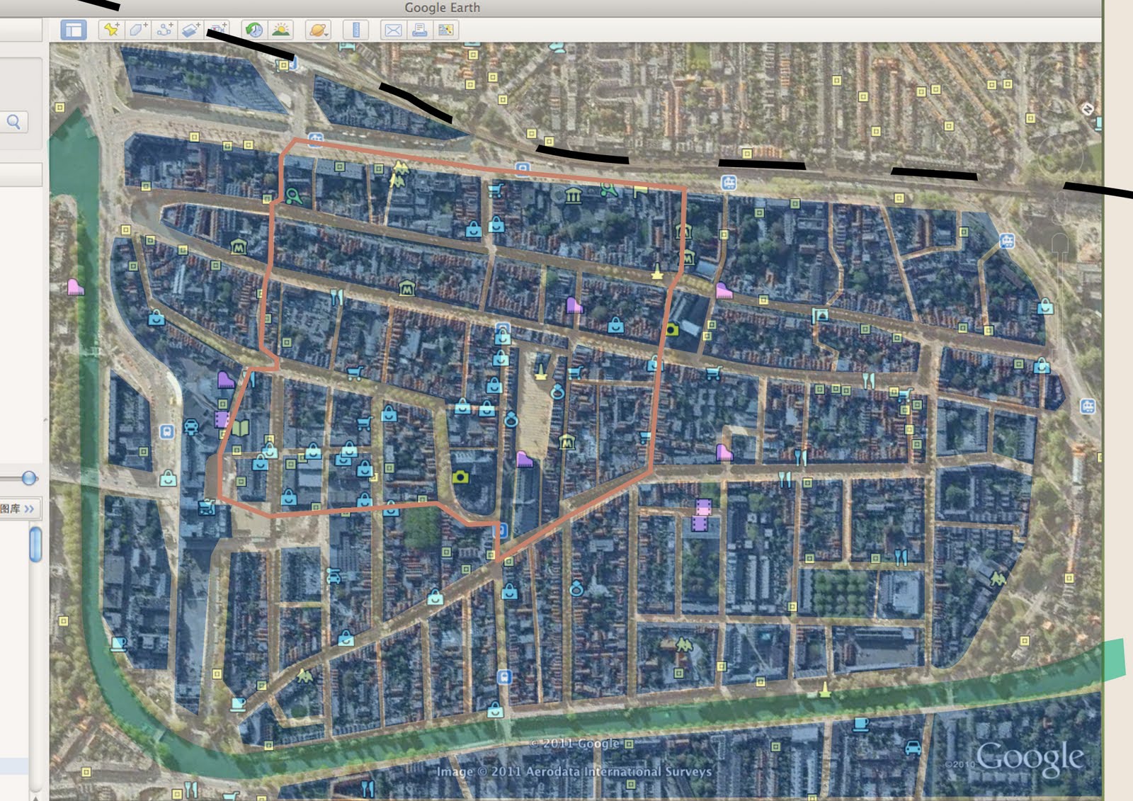
 The source comes from Google Map. At the beginning, we regard that main roads should be paid attention. So we only mark main roads in the map with faint yellow. Then we mark the river with pale green and mark the railway with black. To help improtant area catch visitor's attention, we cover important areas semi-transparent blue and cover unimportant frontier area with semi-transparent white. Thus visitors won't be disturbed by the frontier area. Besides, the circle is marked with gray orange. Finally, all shops and museums are marked with icons from Google Map.
 Then we use color block to present the map. The blank during blocks stands for main roads. The river, railway and important areas are marked with different colors, while other parts are hidden. Thus the map is clear than the former one.
 The circle is marked in this map.

 Then shops and museums are marked in the simplified map. The yellow spots represent museums while the blue spots represent shops. We can use these two maps for two versions in our next step design.
 The source comes from Google Map. At the beginning, we regard that main roads should be paid attention. So we only mark main roads in the map with faint yellow. Then we mark the river with pale green and mark the railway with black. To help improtant area catch visitor's attention, we cover important areas semi-transparent blue and cover unimportant frontier area with semi-transparent white. Thus visitors won't be disturbed by the frontier area. Besides, the circle is marked with gray orange. Finally, all shops and museums are marked with icons from Google Map.
 Then we use color block to present the map. The blank during blocks stands for main roads. The river, railway and important areas are marked with different colors, while other parts are hidden. Thus the map is clear than the former one.
 The circle is marked in this map.
 Then shops and museums are marked in the simplified map. The yellow spots represent museums while the blue spots represent shops. We can use these two maps for two versions in our next step design.
3/07/2011
Clues for making map
Last Friday evening we discussed the clues for our design. We found some points that can be used in our map, which came from our reader and former study.
1 When we use our eyes, we only process details in the centre of the visual field. At the edge of visual field, images are blurry. (Chapter 1) We can make the starting point clear to suggest it is the place worth attention. Other part of the map shouldn’t be as on focus as the starting point so that it won’t catch the first attention.
2 Unique size of dot and oblique direction of dot help to pop out. (Chapter 2) In our map, if we want some museum or shop stand out, we can make the icons bigger than others or give them different direction.
3 The brain of human contains mechanisms that define regions having common texture and color, and we can use texture to make distinct. (Chapter 3) In our map, we can design unique texture for icons to imply direction.
4 Using different channels (forms, colors and motion) can make several things searchable at the same time. Differences in two or more channels can make huge distinction. (Chapter 3) If we want one icon really stands out, we can make difference on more than one channel, such as color and size together.
5 Color codes can help to indicate categories of information. And there are six basic colors that are special and used no matter what the language. (Chapter 4) In our map, we can choose color codes to show different land-use zones as other maps. And these color need to come from special ones to make sure they are accepted by all travelers.
6 Simultaneous contrast increases the difference between a color and its surroundings. And it is called chromatic contrast in red-green or yellow-blue channel. Besides, luminance also affects attention. (Chapter 4) In our design, we can use contrast color on different category of icons and emphasize the difference. Besides, to make the map in the circle catch more attention, we can do something on luminance.
7 Color contrast and luminance helps to objects distinction. (Chapter 4) When we want to hide some route or icons, we can decrease their color contrast and luminance contrast with the surrounding.
8 When we have a lot of icons in the same position, occlusion can provide both a method and a metaphor for rank ordering. (Chapter 5) When we work on our own map, we make the most important icon occlude the less important ones.
9 People have mirror neurons in their brain. And when they see some facial gestures, they will copy them in brain and feel the emotion and action from the image. (Chapter 7) Thus in our map we can use facial gestures to guide users of direction.
3/01/2011
Assignment 1 - GARDEN IN MONTMARTRE WITH LOVERS

This painting, the summery garden – which Van Gogh later referred to as ‘the painting of the garden with the sweethearts’ – is one of the largest canvases he painted. It is also the first work he exhibited in Paris. He painted the park in the Pointillist style that kept him so occupied during the summer of 1887. This technique, in which small dots of unmixed color are placed close together, has been applied fairly consistently here. Carefully crafted in the studio, this painting lacks the spontaneity of much of his other work. The artist’s brushstrokes are nonetheless expressive. The sky, for instance, is rendered with vigorous dashes of paint.
Source: Van Gogh Museum
1 Chapter 2 What We Can Easily See
1. 1 what stands out = what we can bias for
The painting is painted by small dots. Basically, the painting is divided into three main areas, the sky, the plants and the road. The dots’ color in the same area are very similar with each other, they are in the same hue. Also, the dots’ shapes are alike in the same area. (Figure 1) Thereby the elements of features make an area blend into a whole. (Figure 2) These are the things that easy to find out, because the features can be easily seen.

Figure 1 Colors and shapes

Figure 2: areas
“The strongest pop-out effects occur when a single target object differs in some feature from all other objects and where all the other objects are identical, or at least very similar to one another.” (P. 29) Thus, the people in the painting pop-out. The clothing and accessories are composed by different colors, which are not in the same hue. And the high saturation parts are bigger and closer than other areas. The shape of dots and orientations are also not in tune compare to the surroundings. (Figure 3) In conclusion, the degree of feature-level is more complex than the surroundings. They are in different multiple channels. (P. 29) Secondly, the second fixation will be the trees in the middle, because of the contrast color of flowers and leaves- red and green.

Figure 3 next fixation
1.2 The visual search
Bigger pattern has bigger detective field, so we first detective the sky, the grass and the ground. Then our fixation comes to the people on the ground. They pop out. “At every instant in time part of the brain is planning the next eye movement based on the information available from the current fixation of the eye as well as some small amount that is retained from the previous few fixations.” (P. 37) When the people in pink dress and blue suits become the fixation, the two people next to them may be the target of next fixation. (Figure 3) Apparently, the two people are hard to be detected at first stage. They cannot be distinct due to the colors are very similar with the background. And they do not have clear rims for the body shapes. The contrast is not big enough for us to detect at the start. However, the shapes of brushstroke are still diverse compare to the background, so we could discover the people when we have a fixation on the people in front of them.
1.3 Using multiscale structure to design for search
To become a rhythmic painting, to become a painting that can be easily understood and remembered, high level structure make them happen. (P. 41) These area structures are at different scale. For instance, the patterns and colors of people are more complex compare to the surrounding. The color of trees and grass are more complex than sky. These feature lead efficient and fluent eye movement sequences.
2 Chapter 3 Structuring Two-Dimensional Space
2.1 The binding problem: features to Contours
“Our brain constructs contours and areas from the millions of fragmented pieces of information in V1.” Patterns of light, shade, color and motion, help the binding process put disconnected pieces into connected pieces. So we identify the differences of each area in V1, and understand the painting by analyzing the objects in it. By this process, the edge-finding machinery helps we identify the trees, the sky, the bushes, the road and people. (Figure 4)

Figure 4 Edge-finding
2.2 The generalized contour
When people look at a picture, they need to understand the objects in the picture. People instantly search for the objects, and make plans for eye search movement. “An object may be separated from its background in many different ways including luminance changes at its silhouette, color differences, texture boundaries, and even motion boundaries.” (P. 49) People could distinguish the sky area, tree area, road area and people area by their color and shapes distinctions. (P. 49)
Let us have a closer look at the people that in the picture. The three groups of people are at different distance. In order to show the spatial distance, the painter used diverse methods to reach the goal. Refer to the book Visual Thinking for Design; line drawings are so effective in conveying different kinds of information. The couple on the left side pops out, the painter draws some black lines along the bodies. (Figure 5.1) Therefore the couple draws people’s attention in the first place. After this, the other couple on the right side will be detected; the color of their wear is very distinct from the surrounding. Even though the edges are vague compare to the couple on the left side. (Figure 5.2) Following this, people could eventually find out the two people that ‘hide’ in the background. They do not have clear contours, they are in the similar colors with surroundings, and then they are involved into surrounding. Those reasons create out the feeling, they are the farthest ones. (Figure 5.3)

Figure 5.1 Figure 5.2 Figure 5.3
2.3 Texture regions
Except for the couple on the left side and some trunks, they have some black lines as clear contours. Most of the objects do not have explicit contours. The contour extraction mechanism generates the contour by assemble the features together. The texture element orientation, shape and color which could be analyze in V1. (P. 50) As what we could see in figure 1, the whole painting was painted by small dots. People start thinking the dots as a texture when the dots have similar orientations, shapes and colors. Figure 6 illustrates the organized dots of each area. The properties of texture make these areas distinct. The dots of sky are straight blue lines which are at 45 degree. The dots of trees are straight lines that point to a center, form the crowns of a tree. Short and crosswise dots are used to show the texture of grasses and road. Bushes and short grasses are cut apart by vertical grasses, which are in straight and vertical lines of long length.

Figure 6 texture differences
2.4 Spatial layout
“Group of objects can form patterns based on the proximity of the elements.” (P.56) Take trees for examples, the crowns are made of dots that point to a center and the crowns of trees can be seen as elements of a tree as well. They provoke a response from a large-shape detecting neuron, and form the shape of a tree. (Figure 7) The law is also used in forming the other areas, such as the bushes.

Figure 7 spatial grouping
3 Chapter 4 Color
3.1 Channel properties
This painting is an impressionism painting. This type of painting emphasize on the accurate depiction of light in its changing qualities (often accentuating the effects of the passage of time), ordinary subject matter, the inclusion of movement as a crucial element of human perception and experience, and unusual visual angles. (Wiki: impressionism) The painter use massive soft colors in chromatic channel, but chromatic channels have less capability to convey detail information. “Chromatic contrast occurs in the red-green and yellow-blue channels. Its effects are much more complex and harder to predict than grey-scale contrast.” (P. 70) In addition, “Shape perception is based mainly on luminance channel information, color sequences that vary mainly in luminance will be the most effective in revealing patterns in the data.” (P.81) So we only could detect the vague shape of each area, and the distance between each objects. This subtle vision gives us the impression of a summery garden to show painter’s experience and perception.
Furthermore, “The brain’s processing of stereoscopic depth information is done via the luminance channel.” (P. 71) So the painting seems a little bit flat. The stereoscopic depth only can be perceived by the low saturation color in the background. “The luminance channel can process shape-from-shading, whereas the chromatic channels cannot.” The painting is lacking of the colors from luminance channel, so that the objects do not have obvious shading which could show the shape in three-dimensional surfaces. We can see the threes blend into a whole in figure 8 as powerful evidence.

Figure 8 threes blend into a whole
3.2 Color-coding information
The unique hues first are red, green yellow and blue, these colors are widely use in this painting. “A strong pop-out effect depends both on the other colored objects in the scene and on the background color.” (P. 77) For this reason, red umbrella, pink dress and red flowers pop out. Because red is the contrast color of green. Red and green are at the ends of middle- and long-wavelength-sensitive cones. The surroundings are trees and grasses, basically are green, although the green are in different hues. In addition, the background colors are low saturation colors, the small area like people and flowers are higher saturation colors. (Figure 9) Higher saturation colors get more attractions. The short-wave-length colors have fewer chances to be dug out than long-wave-length colors, such as blue and purple. (P. 67)

Figure 9 color-coding
3.3 Semantics of color
Blue is usually stands for quiet and soft feelings. Green is usually stands for vitality, hope, friendly, peace and fresh feeling. These two colors describe the mood of garden in the summer. The environment is pleasant enough for people to visit in summer time. Red and white indicates it is the middle of summer; it is the best time in this season. The vivid flowers even provide people a feeling that they are in a sweet smell atmosphere, because of the flowers are booming. What’s more, red is a high saturation color; it attracts people by their first sight. In that case, it emphasizes that the flowers are booming, and people are involved in the smell of flowers. This kind of feeling meets painter’s purpose, which creates a sweet atmosphere for sweet couples.
Besides, the umbrella is red, the dress is pink, and they also hint the couples are in heated love.
Subscribe to:
Comments (Atom)