The following are the process of our design
Before design: Discussing about clues for making map
First concept of the map
Second concept of the map
After that, we had a meeting with professor. He gave us some suggestions and we changed our map a bit.
The main changes are listed as following.
l The circled block in the background is moved out. Now the background is a whole ancient map. There are no area that is paid more attention.
l All the free hand drawing icons for museums and shops are moved in the circle.
l In the previous version, the icons for shops are only logo for some shops, which is not as interesting as the museums icons. Now all the icons for shops are drawn by hand.
l The starting point is moved to central line of the circle, and the railway is horizontal and the color is softened. All these are meant to prevent any influence from the starting point and the railway.
l The icons for museums and shops should be almost the same size to balance the circle.


Now how do you think about the Delft Map?
We plan to test it in Hague. There are two groups with two people in each group. Since none so us speak Dutch, it will be a challenge for us!
On Friday, We did some tests with our friends. They gave us some comments:


To help uses to distinguish between these two versions of circles, we add three elements in our design: color contrast, size contrast and shadow change. In the route P for shopping, we make icons for shops larger yellow circles, while the icons for museums are smaller and grey. When seeing the image, users’ attention will be attracted by the yellow ones, and choose the anti-clockwise direction. Besides, the upper left shadow indicates the light sources comes from bottom right direction and attracts users to choose the anti-clockwise direction. While in route T, elements are entirely opposed, hints for clockwise direction will be more obvious.
In our progress for designing the map, we make several versions and test the function of shadow and color. The color contrast works better than shadow change. Some users even feel nothing about the change of shadow.

The following are icons for museums in Delft.


For further design, we also need to give two versions of circle and present rich elements to indicate direction for users.
From the former presentation, we knew that the requirement of assignment is misunderstood. We are not supposed to make one travel map, but one travel circle. The image should present one perfect circle, to indicate the general direction to travelers who search for shops or museums.
Delft is famous for the portrait “Girl with a Pearl Earring” by Jan Vermeer. We took the metaphor of pearl and chose pearl Necklace to be the circle. Every pearl represented one shop or museum. The images of shop or museum were showed from the pearl, never covering the luster of pearl. The direction was indicated by size and spacing of pearls. While in this concept, images of icons were difficult to handle and time consuming.


Pie Chart
The most important reason for this concept was that the outline of pie chart was born perfect circle. This pie chart was supposed to be divided into several parts, and each part represented one museum or shop. We planned to use occlusion of to indicate direction. Besides, we planned to draw the name of scenic spots outside the circle. And the shape of name could also indicate the direction.

Cartoon river circle
We noticed there were rivers in delft centre, and thus we used the image of river to be the circle in this concept. And we wanted to use cartoon style for the whole image. Each icon of shops and museums should be drew by ourselves and present a feeling of childish. Finally, we decided to develop this concept into our final design. Two group members planned to draw icons and river circle while one group member prepared for user test and movie.


The first picture shows the sketch for our design. We simulate the image of contradictory stairs in our map. Stairs present feeling of guiding people, thus we can use stairs to imply direction. The whole map is drawn in 2.5 dimensions. We use two colors in the map: blue and orange. They are contrast color and user can distinguish between them easily. Thus the circle is drawn by two colors. Besides, all the icons are separated by these two colors two. Therefore users can find the group of icon: museums or shops. Two groups of icons face two directions, which help people to distinguish between them. The circle and icons might be added with shadow. The style for the whole map is Delft-Blue. Delft-Blue is the symbol for this city, and we can create some pattern of delft-blue in the corners of the map to make the map more unique.
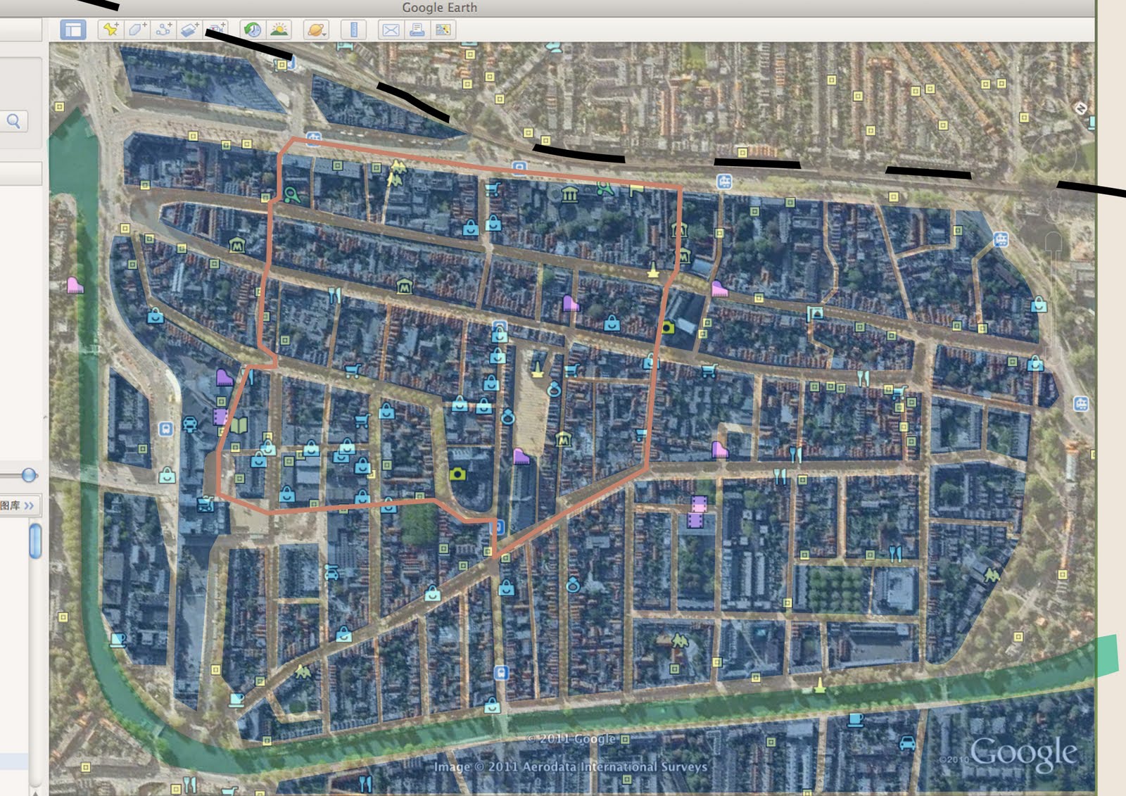 The source comes from Google Map. At the beginning, we regard that main roads should be paid attention. So we only mark main roads in the map with faint yellow. Then we mark the river with pale green and mark the railway with black. To help improtant area catch visitor's attention, we cover important areas semi-transparent blue and cover unimportant frontier area with semi-transparent white. Thus visitors won't be disturbed by the frontier area. Besides, the circle is marked with gray orange. Finally, all shops and museums are marked with icons from Google Map.
 Then we use color block to present the map. The blank during blocks stands for main roads. The river, railway and important areas are marked with different colors, while other parts are hidden. Thus the map is clear than the former one.
 The circle is marked in this map.
 Then shops and museums are marked in the simplified map. The yellow spots represent museums while the blue spots represent shops. We can use these two maps for two versions in our next step design.